Wednesday, June 06, 2012

Cover Art Part 4: Color At Last!

(Part 1 of the Tutorial started HERE) 

Oooh, I LOVE color. So experimenting with color schemes was fun for me. As I played with different colors, I always kept in mind my concept. Which brings us to the next step...


Step 4) Play with different color schemes. 
Ask what colors best convey the mood, the message, the main concept. If you sketched your thumbnail out on paper, take it and run it through your art program, playing with colors quickly. And if it will be an e-book, remember some readers do not have color Kindles yet and will be seeing it in black and white. So, make sure you use values that allow the image and text to read well in black and white, also. Yeah... tall order.

Here's what my finished cover looked like in black and white. The yellow sub-title wasn't as light as the white text at the top, but still readable (isn't it amazing the difference color makes?!)


Here are just some of the color experiments I did. And yes, some are ghastly, LOL! The point is, don't be afraid to experiment.


Now is about the time you could firm up your chosen sketch and color scheme and send it to your author  for some feedback. My author was a gem to work for, and very trusting. She didn't ask that I do this step, but I really wanted to make sure she was happy with the direction it was going. She was!

Here was the "mock up" cover art I sent her. See why I said she showed a lot of trust in me, that it would turn out nice in the end? It's pretty rough!


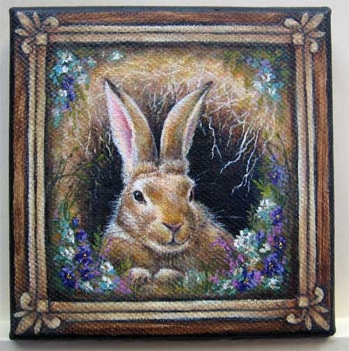
And for comparison, here again is the final version (can click to enlarge).


Part 1 of the Tutorial starts HERE.  The Steps are more fully explained in each post. 

The Process Summary:
Step 1) What is the main concept; think simplicity
Step 2) Find out the needed technical stuff: aspect ratio, pixels, file size etc.
Step 3) Do a lot of quick thumbnails, in black and white (pencil or digital)
Step 4) Play with color schemes, which supports your concept best
Step 5) Gather any needed reference material
Step 6) Finalize your sketch; think both large & small image readability, & bold text
Step 7) Transfer sketch to your support if paper sketching; or scan in to computer
Step 8) Continue in your chosen medium, or in photoshop (working in Layers) 
Step 9) Font: readability is priority one; must be allowed for commercial use
Step 10) Final copies. Save in PSD. Send needed sizes to author, or what's required by publisher. 
The ideas here are most applicable to the traditional artist who is using a digital art program to do the finish work. Those making 100% digitally created cover art are a horse of a different color. ;-)

Thanks for reading, and I'd love to hear what you think!

Monday, June 04, 2012

Cover Art Part 3: Fun with Thumbnails


(Part 1 of the Tutorial started HERE) 

Oh goodie. We made it past the technical stuff and today are into the fun stuff. :-)


Step 3) Do a lot of quick thumbnails. 
Fast little sketches... my first ones are sometimes no more than 3 or 4 inches. Play with it. Try out various compositions, just using pencil or pen, in black and white. Don't worry about color yet. Some of these ideas will vary in their usefulness to you. It depends if you are working on your computer in an art program, with pencil and paper, or a combination of both (which is how I ended up doing it). 

I forgot to take photos of the various thumbnails I sketched, so found only these early ones that I didn't use:


Did you notice above where I wrote "in black and white"? Trust me, there are several advantages in doing your thumbnails this way. The biggest one being, that if an image "holds it's own" in black and white, it will almost ALWAYS work in color. 

In fact some say almost ANY color will work if the values (relative darks and lights) are done well. Plus, you don't want to invest lots of time in a thumbnail; do lots, fast and sketchy, trying out all kinds of crazy ideas. If you find one you really like, then you can invest a little more time on it.

Tip: Is your image boring? Bland? Blah?  
Solution: try punching up the values. Make your lightest lights LIGHTER, and your darkest darks DARKER. Not all over, just in chosen spots to give it sparkle and drama. If working on paper, scan it in to your art program, and play with the values. You might be pleasantly surprised.

An example:

1. Here's a painting of mine as it would look if there were not enough value contrast. Blah...


2. Here's the same painting, with high value contrast, the lights and darks both punched up. 


3. And here is how that plays out in color. 


Next time, we get to play with COLOR... yay!!!


Part 1 of the Tutorial starts HERE. The Steps are more fully explained in each post. 

The Process Summary:
Step 1) What is the main concept; think simplicity
Step 2) Find out the needed technical stuff: aspect ratio, pixels, file size etc.
Step 3) Do a lot of quick thumbnails, in black and white (pencil or digital)
Step 4) Play with color schemes, which supports your concept best
Step 5) Gather any needed reference material
Step 6) Finalize your sketch; think both large & small image readability, & bold text
Step 7) Transfer sketch to your support if paper sketching; or scan in to computer
Step 8) Continue in your chosen medium, or in photoshop (working in Layers) 
Step 9) Font: readability is priority one; must be allowed for commercial use
Step 10) Final copies. Save in PSD. Send needed sizes to author, or what's required by publisher. 

The ideas here are most applicable to the traditional artist who is using a digital art program to do the finish work. Those making 100% digitally created cover art are a horse of a different color. ;-)


Thanks for reading, and I'd love to hear what you think!

Retta

Saturday, June 02, 2012

Cover Art Part 2: Yikes...Techie Stuff


Back with more of the Cover Art Tutorial. 

Part 1 started (HERE).  


Today let's tackle Step 2. Not exactly exciting, but necessary.


Step 2) Take care of the technical stuff. 
You need to know what aspect ratio will be used for the final cover art ... the relationship between width and height of the image. Aspect ratio is about the shape, not the size.


If you get it wrong, when it's enlarged or reduced, edges could be cut off, or you could end up with white edges you hadn't intended, ruining your book cover. 

So.. you need to know the end, before you begin. If it's to be a print book, the publisher will have this info. Ditto for Amazon books, or Smashwords, or Lulu, etc etc. They'll tell you the required aspect ratio for the cover art in their instructions. They'll also have requirements for formatting (jpegs, gifs, etc) and the necessary resolution sizes (pixels) to submit.


My author, Jules at Big Girl Bombshell,  sent me the required measurements, and I went from there. I worked a little larger than the final book cover would be printed, but within the same aspect ratio. Here's a Wikipedia article  on image aspect ratios if you'd like more on the technical stuff. 

Some common aspect ratios are:
1:1 which gives you a square
2:3 which most nice digital cameras use
3:4 which is what is used for ebook reader devices
4:5 which is used for 8 x 10 prints
5:7 which gives you a rectangle


Since ebooks must keep in mind the end user device, such as a Kindle reader, places like Amazon tell you to make your image with a 3:4 aspect ratio to fit them. Be sure to look up the specific requirements for whatever epublisher you plan to use, such as Amazon, Smashwords, Lulu, etc. They'll cover it in great detail.

Are we bored out of our skulls yet???!!! 


Okay, here are some visual examples:

Let's say you have this quirky dog about which you simply MUST write a book. You take a photo, and crop it square.
That would be a 1:1 aspect ratio. Cute photo, but troublesome if using for an ebook cover. 


Here's what would happen if submitted as is, and they needed to change the aspect ratio to, say, 5:7


But if they wanted all of the pup included, they would have to do this to retain that overall 5:7 aspect ratio:


So, you save the day by adding a black border to convert the whole shebang into their needed 5:7 aspect ratio:


Clear as mud??

In a nutshell, just make sure that your readers will see what you intended them to see, by making your cover art the required measurements. :-D


Part 1 of the Tutorial starts HERE.  The Steps are more fully explained in each post. 

The Process Summary:

Step 1) What is the main concept; think simplicity
Step 2) Find out the needed technical stuff: aspect ratio, pixels, file size etc.
Step 3) Do a lot of quick thumbnails, in black and white (pencil or digital)
Step 4) Play with color schemes, which supports your concept best
Step 5) Gather any needed reference material
Step 6) Finalize your sketch; think both large & small image readability, & bold text
Step 7) Transfer sketch to your support if paper sketching; or scan in to computer
Step 8) Continue in your chosen medium, or in photoshop (working in Layers) 
Step 9) Font: readability is priority one; must be allowed for commercial use
Step 10) Final copies. Save in PSD. Send needed sizes to author, or what's required by publisher. 

The ideas here are most applicable to the traditional artist who is using a digital art program to do the finish work. Those making 100% digitally created cover art are a horse of a different color.   ;-) 


Thanks for reading, and I'd love to hear what you think!

Friday, June 01, 2012

A New Book is Born! Cover Art Part 1

A few weeks ago I wrote a post titled Commission Work: Love It or Hate It?  My usual take on it is... well, not on the Love It side. :-)

But, I've met so many wonderful people in the blogsphere, and sometimes we just connect at the heart level. One of those people was Jules aka Big Girl Bombshell.  

Jules is a writer, and she asked me to consider doing the cover art for her new book (HERE)

Click 3 Times 
Beyond the Flying Monkeys 


 It didn't take me long to say yes! 


In honor of Jules' new book announcement (which is due out this summer), today I'm starting a tutorial series based on her book cover. It'll be a peek behind the curtain at how the art was created.

I plan to cover it all:
  • from the ratty looking preliminary sketches 
  • to playing with color schemes (some were ghastly!) 
  • to what all the symbolism on the cover means
  • to tips on how to create your own cover for that e-book you know you want to write
  • to the finished book cover

I'm sort of new at this book cover thing, so I'll also share with you what NOT to do, based on my own mistakes. :-O

It won't be an exhaustive tutorial, but it'll help you get started, and maybe save you some time and give a general outline of the process.

To begin, here's where we are headed, the finished cover art (can click to enlarge):


Jules was easy to work for. She's a colorful writer, and uses a lot of word imagery. Her book is based upon that familiar favorite old movie The Wizard of Oz, and she courageously and creatively tells her own story.


The cover art Process:
Step 1) Ask yourself, what is the main message? What's it about, the biggest idea, the concept. There are lots of tutorials on the web to help with this if you need ideas. But basically, think "simplicity".

My author had lots of ideas she hoped to convey on the cover, so it was a challenge to make it work, without looking too cluttered. 

Today, I thought it would be fun to explain the symbolism on Jule's cover art. She uses the Wizard of Oz as the source of her metaphors, and I tried to show a lot of that on the cover.
Here's a close-up image (can click to enlarge):


  • Yellow of course, for the Yellow Brick Road
  • Spiral, swirly shapes in background, for tornado, the journey and traveling the Yellow brick road
  • 3 images of the numeral 3, for click the heels together 3 times to go home
  • Blue, for bluebirds in Dorothy's song Over the Rainbow
  • Green, for the Emerald City
  • Red and twinkles on the large 3 in title, for the ruby red slippers
  • All colors of the rainbow present
  • Flying monkey is small and grayed, no longer powerful over us
  • Heart at center for several reasons: this journey taking heart; the tin man wanted a heart; we are on a journey to find our true heart, our authentic self
  • Red and green at lower sides, for the poppy fields, places where we can get sidetracked or led astray
  • Silhouette of the 4 main characters (and Toto); they are copyrighted images, yet so iconic that even as a silhouette, everyone knows who they are
  • And lastly, purple, an exotic color that evokes the story of Oz, the changing colors in it; it is the color of wisdom, spirituality, royalty and wealth.

That's a lot to cram into one book cover! Next time, I'll continue the Steps of the process. Hope this was helpful. If not, at least entertaining, LOL!!


I'll end each post in this series with a link back to the beginning of the tutorial (today's post). The Steps will be more fully explained in each post.


The Process Summary:

Step 1) What is the main concept; think simplicity
Step 2) Find out the needed technical stuff: aspect ratio, pixels, file size etc.
Step 3) Do a lot of quick thumbnails, in black and white (pencil or digital)
Step 4) Play with color schemes, which supports your concept best
Step 5) Gather any needed reference material
Step 6) Finalize your sketch; think both large & small image readability, & bold text
Step 7) Transfer sketch to your support if paper sketching; or scan in to computer
Step 8) Continue in your chosen medium, or in photoshop (working in Layers) 
Step 9) Font: readability is priority one; must be allowed for commercial use
Step 10) Final copies. Save in PSD. Send needed sizes to author, or what's required by publisher. 
The ideas here are most applicable to the traditional artist who is using a digital art program to do the finish work. Those making 100% digitally created cover art are a horse of a different color. ;-)


Thanks for reading, and I'd love to hear what you think!

Retta


Saturday, May 26, 2012

Kinkade: Love Him or Hate Him


Say Rembrandt, and you know exactly who that is.

Say Rockwell... ditto.
Say Picasso... ditto.
Say Kinkade... ditto.

Most people are not neutral when it comes to Thomas Kinkade. They seem to either love him, or not. Most people, at least in the art world, are aware by now that Mr Kinkade passed away in April of this year.

Here's a short bio to help you understand the man better... to see why he emphasized the commercial side of his art.

See, he had a rough start. He was born in California in 1958, and had a father that left the family destitute when he was just five. He decided early on that he would never do that to his family. 

His mother was left to raise 3 kids on a modest secretaries salary. So to his critics who simply sneer at the business side of his empire, I say consider his early influences before you judge so harshly. You can read more of his bio HERE. 


I believe people liked Thomas Kinkade paintings for the way the images made them feel. 

Period. 

They didn't care about all the high-brow snobbery in the art world, and Thomas Kinkade knew that. He was like Norman Rockwell in that sense: he painted the world the way he wanted it to be, not necessarily how it was... just like Rockwell. 

But there's another side to Mr Kinkade most don't even know about: his Plein Air work. Check out his plein air work to see the REAL Thomas Kinkade, what he painted when he painted for himself. 


Yes, I have a soft spot for Mr Kinkade, even though some of his work could be called "too pretty" or predictable. However, it still has that glow, and usually makes me smile and is calming and peaceful. What's wrong with a little beauty in a world that at times can get ugly?? 


The man was not perfect, and stirred up his share controversy, made his share of mistakes. Who among us would want all our dirty laundry made public?? The man's dead. His family is grieving. Let's offer some compassion and kindness. 

I, for one, give him credit for doing what most artists can't do: he made a great living from his art and supported his wife and children from said art. And along the way, made millions of collectors happy. I don't have a problem with that. 

Rest in peace, Mr Kinkade.


With respect,

Retta

Thursday, May 17, 2012

Just For the Love of It


You don't need to be an official "expert" to share your passion with others!

This coming Saturday my photographer husband, Jim, is leading an outdoor photography field trip. He's taking his litle class of 11 to a beautiful and famous park in Ashand, Oregon, Lithia Park.  This 93 acre park, with 2 duck ponds, is one of his favorite places for gorgeous photos.

While announcing the class, Jim was asked: "What makes YOU an expert?" 

Jim's answer was: "I don't know that I am, but I'm just sharing with others what I know." And I also know, without even trying, he will be passing along his passion for finding "the" photo. He can't help it... he loves it, and it comes out.

Painting and photography have so much in common, so I find his class interesting.

Here's are some of his class handouts (can click to enlarge):


(example of using reflections and the Rule of Thirds)


(example of lighting effects)


(example of movement & reflections)


(example of the Golden Hour)


(example of composition and back lighting)


(example of a macro as subject 
matter and lighting effects)


(example of natural framing)


(example of showing size and proportion)


(example of low light 
and unusual composition)


And lastly, one of my favs: an old tough craggy tree above Crater Lake, Oregon. To me, it speaks of strength, determination, and power. No matter what, it's there, strong and proud. For whatever reason, that speaks to my heart, and I cheer it on.


(example of drama with silhouettes)


Happy painting, even if you don't feel you are an "expert",

Retta

Friday, May 04, 2012

Friday Favorites: 11 Year Old Artist!


Today for Friday Favorites I'd like to showcase a budding young artist named Chirag Vedullapalli.


Chirag is an 11 year old artist that warms my heart!  I stumbled on his colorful paintings and stopped in my tracks. He's a member of Creative Children for Charity,  and donates his sales to raise money for Seattle Children's Hospital.


Chirag says: 

"I am blessed to be an artist. I am 11 years old and passionate about inspiring kids and my community create art. I always wanted to have a new talent for my family since my parents have been engineers... Art is my passion and that is what I do best." 

(When you visit Chirag's page, you can scroll all the way to the bottom to read the complete message) 

Here is Chirag's Art Gallery on the Meylah website. My FAVORITE is "Pride of the Tribe!" Please go see it... you will not be disappointed! 

We need not worry... the next generation of artists with big hearts is safely on the way. :-)

(Just a tiny snippet of Pride of the Tribe
please click on this LINK to see full image) 


Happy painting... at any age

Retta