
(Part 1 of the Tutorial started HERE)
Oh goodie. We made it past the technical stuff and today are into the fun stuff. :-)
Step 3) Do a lot of quick thumbnails.
Fast little sketches... my first ones are sometimes no more than 3 or 4 inches. Play with it. Try out various compositions, just using pencil or pen, in black and white. Don't worry about color yet. Some of these ideas will vary in their usefulness to you. It depends if you are working on your computer in an art program, with pencil and paper, or a combination of both (which is how I ended up doing it).
I forgot to take photos of the various thumbnails I sketched, so found only these early ones that I didn't use:

Did you notice above where I wrote "in black and white"? Trust me, there are several advantages in doing your thumbnails this way. The biggest one being, that if an image "holds it's own" in black and white, it will almost ALWAYS work in color.
In fact some say almost ANY color will work if the values (relative darks and lights) are done well. Plus, you don't want to invest lots of time in a thumbnail; do lots, fast and sketchy, trying out all kinds of crazy ideas. If you find one you really like, then you can invest a little more time on it.
Tip: Is your image boring? Bland? Blah?
Solution: try punching up the values. Make your lightest lights LIGHTER, and your darkest darks DARKER. Not all over, just in chosen spots to give it sparkle and drama. If working on paper, scan it in to your art program, and play with the values. You might be pleasantly surprised.
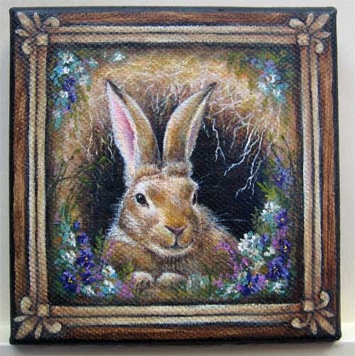
An example:
1. Here's a painting of mine as it would look if there were not enough value contrast. Blah...

2. Here's the same painting, with high value contrast, the lights and darks both punched up.

3. And here is how that plays out in color.
Next time, we get to play with COLOR... yay!!!

Part 1 of the Tutorial starts HERE. The Steps are more fully explained in each post.
The Process Summary:
Step 1) What is the main concept; think simplicity
Step 3) Do a lot of quick thumbnails, in black and white (pencil or digital)
Step 2) Find out the needed technical stuff: aspect ratio, pixels, file size etc.
Step 4) Play with color schemes, which supports your concept best
Step 5) Gather any needed reference material
Step 6) Finalize your sketch; think both large & small image readability, & bold text
Step 8) Continue in your chosen medium, or in photoshop (working in Layers)
Step 9) Font: readability is priority one; must be allowed for commercial use
Step 10) Final copies. Save in PSD. Send needed sizes to author, or what's required by publisher.
The ideas here are most applicable to the traditional artist who is using a digital art program to do the finish work. Those making 100% digitally created cover art are a horse of a different color. ;-)
Thanks for reading, and I'd love to hear what you think!
Retta
Ah, yes. I've learned to play with those. I'm not as good at it as you are ... not yet.
ReplyDeleteYou're doing great with yours!!
Delete