(Part 1 of the Tutorial started HERE)
It's time to see those WIP pics... Work In Progress photos. This one IS a bit long, because I just couldn't help myself... I threw in a bunch more Tips. :-D
If finishing in photoshop (or your particular art program):
Be SURE to work in Layers
Extremely important. That way if you want or need to change one element, you simply go to THAT layer and do the work. You don't have to spend days re-creating the art, because you lost it when a change had to be made. This is one thing I did right, LOL!
For a recap, I put the pics in order here:
The beginning
The finalized sketch
First traced layer
Started the underpainting of the background, started the 3 for the title, carefully leaving enough room for the text later. Since it was to be finished in photoshop, I didn't worry too much about the edges
Tip: I recycle old phone books to use as absorbent wipes for my brushes. The cheap thin paper is super thirsty and I just swipe my brushes on it. When dirty, I throw the top one away, and a new one is ready to go. I tear out a thin stack at a time from the phone book, and they sit to the left of my easel (I'm left-handed).
Ah... the Ugly Stage. I wrote a whole post about that HERE. :-)
At this stage, I'm redefining edges, laying in local color from back to foreground; underlayers and larger masses first; more detail last; sky, then trees, then road, then side of road in that order.
My ugly stages always look a tad on the dark side, but it's setting the foundation for the later lighter layers.
Tip: Since it's important the image looks good small in addition to full size, a quick and easy way to check this is by using a "reducing glass". It's the opposite of a magnifying glass. This is how I realized my red poppies weren't reading right when viewed as a thumbnail. So, out came the Cad Red Medium, straight from the tube!
Dried it well with a hairdryer on cool; traced on the silhouette and the flying monkey, and re-established the 3 in the top title. It was important to be precise in the final placement of the 3 because of the text to be added later. No winging it here!
The painting is still a little dark; haven't added the last layer yet with highlights and zing.
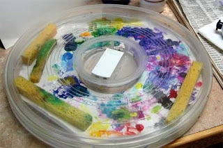
Tip: I paint with acrylics mostly. Over the years I've tried all kinds of palettes designed to keep the paints moist. Additives help, but the best stay-wet palette system I found almost 20 years ago is from Dick Blick. They now call it the Richeson Lock Box, HERE. With different inserts, it can be used for acrylics, oils, watercolors, you name it. It works.
It has a simple click on lid, with little sponges that stay inside and keep it humid. I added a couple of extra sponges, and I occasionally give it all a mist of water. Low tech... nothing fancy, but it sure works. Yep, I'm messy. When I can't find a clean spot, I just pop in a fresh palette paper. :-)
Tip: Sometimes I just need to see tiny detail, and find this little clip on magnify works fantastic.
I clip them on my reading/painting glasses (they also make some for those that don't wear glasses). I have some stronger ones (10 diopter) from my miniature art days, but these are 5 diopter magnification, and work great for this type of detail. They are called Opticaid (HERE) and can be found online at places like Amazon and specialty websites. Totally worth the price if you do detail work. Even though I'm working in tiny detail, my eyes relax, and it's not stressful on them at all.
Next, adding the last bits of detail and highlights that I can, til I see exactly where the text will fit.
Whew!
We're almost finished with the series. Next time we'll add the text and wrap it up.
Part 1 of the Tutorial starts HERE. The Steps are more fully explained in each post.
The Process Summary:
Step 1) What is the main concept; think simplicity
Step 3) Do a lot of quick thumbnails, in black and white (pencil or digital)
Step 2) Find out the needed technical stuff: aspect ratio, pixels, file size etc.
Step 4) Play with color schemes, which supports your concept best
Step 5) Gather any needed reference material
Step 6) Finalize your sketch; think both large & small image readability, & bold text
Step 8) Continue in your chosen medium, or in photoshop (working in Layers)
Step 9) Font: readability is priority one; must be allowed for commercial use
Step 10) Final copies. Save in PSD. Send needed sizes to author, or what's required by publisher.
The ideas here are most applicable to the traditional artist who is using a digital art program to do the finish work. Those making 100% digitally created cover art are a horse of a different color. ;-)
Thanks for reading, and I'd love to hear what you think!
Retta
"We are the cups, constantly and quietly being filled.
The trick is, knowing how to tip ourselves over
and let the beautiful stuff out."


No comments:
Post a Comment