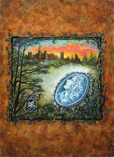
Back in June I posted a seven part Cover Art Tutorial (HERE). So today, instead of including instruction, I'm excited to simply share the WIP (work in progress) photos of the cover art I made for a new story coming out in August.
The author is my sister Karen Elizabeth Brown
(her blog is HERE) and the story is titled
Medieval Muse
Her first announcement for her new story, which will be a free download from Smashwords, is HERE.
Okay, enough chatting... let's see how this thing was created. :-D
(As always, click on pics to enlarge if you'd like)
First, the noodling around with thumbnails, playing with ideas. I also did a lot of research on medieval imagery, authentic cameos, and castles. I ALWAYS enjoy the research part... it's fascinating, like peeking into the lives of our ancestors and history. And I have to reign myself in or I'd spend way too much time on it. :-}
Here are a few of those thumbnails...
Next I put together some mock-ups and
sent them off to the author for feedback..
Also converted one to black and white,
to check values and see how it would read
on the older Kindle devices.
Final design on tracing paper, ready for transfer...
Painted on heavy watercolor paper with acrylics.
Note I left some things to be finished in Photoshop...
Close up of the painting ready to scan...
Hey... you're ignoring me!!
I get so lost in my imagination, Joey had to
jump up and beg for attention, poor girl...
Now we are inside Photoshop with a close up. Here I've finished the background, simulating old leather; added the morning sun rising behind the castle; added highlites and reflections, and deepened shadows...
Now the glow from the medieval cameo.
As you will read in the story... this is no ordinary cameo!!
Finished with all the final touches.
Here is a close up for the curious who, like me,
enjoy a close peek. Remember you can click it
to make it even larger...
I loved this font because it looked old and carved from stone.
And here it is, the finished cover art for Medieval Muse!
I hope you found this interesting, and don't forget to visit Karen's blog for the book Launch Party that will take place August 1 - 6, when you can download her story for free from Smashwords.
Thanks for reading,
Retta


Thank you, Loretta, for all the care you put into making my cover look so authentic. It has a 3-D effect you can't get in cut and dried images. I especially love the detail around the cameo and the glowing effect. And here's something: her hair is described as being long and curly in the story. Hmm... how'd you know that?
ReplyDeleteI'm so glad you like it! :-)
DeleteThis is a really beautiful piece Rettakat!!! I think the artistic process is so cool! Thank you for sharing. ^^ :)
ReplyDeleteThank you for visiting, Amanda Rose. I'm happy you enjoyed it. Thank you!
DeleteI was directed over to your blog by L.G. at Writing Off the Edge (http://lgkeltner.blogspot.com) and I absolutely love your work! I am trying to make a career of my artwork myself and I truly love seeing works by fellow artists out there. I especially love your work with colors! I look forward to seeing what else you post!
ReplyDeleteThank you Chelsea, what a lovely comment! I'm so glad to "meet" you. :-)
DeleteThe font is perfect. It's a beautiful cover. Yay for Karen. Joey made me laugh. I get that from my cats when I'm writing ... they jump on me ... 'hey you'.
ReplyDeleteThanks, Mary. I was so glad it turned out good. :-)
ReplyDelete