Wednesday, June 13, 2012

Cover Art Part 7: We Made It!


(Part 1 of the Tutorial started HERE) 

We're on the homestretch. The painting has been scanned in to photoshop, and ready for the finish work. (As always, can click any pics to enlarge)


For a re-cap, here was the pencil sketch:


Here is how raw it looked at first scan into photoshop:


Step 9) The text. 
Absolutely make sure you use separate Layers for the text. Pick your font with care. Number one priority: readability, both large and small versions of the cover. I know, I already mentioned that... but it's that important. :-)

The whole point is Communication. If it can't be read, it's worthless.

The legal stuff: If you download free fonts, make sure it says you are free to use it for personal AND COMMERCIAL use. Many are only for personal use only. You can NOT use this for a book cover that will be sold. I found so many cool fonts that I dearly wanted to use, but... nope, they were for personal use only.

I hunted high and low trying to match the font from an old movie trailer for the Wizard of Oz. I couldn't find it, so just came as close as I could to the feel of that font. Here's that neat old movie title page:


Here we are, waiting for touch-ups and text:


Cleaned up the edges; removed the texture where it shouldn't be; added a glow around the silhouette; added reflected light to the flying monkey; added color and highlights to the title 3; added final sparkles here and there.


I experimented with a curved Title, to mimic the shape of a rainbow. But when the cover was reduced any smaller, it was extremely hard to read.


In the end, I chose readability over nostalgia:


And here is what I chose for the Sub-title. It needed to be readable, yet subordinate to the main title. And since the concept that Jules was presenting was the idea of going BEYOND the flying monkeys, I used the Warp Text tool to make that word stand apart.


This part of the design, the three 3's,  was made using a stencil font. I then went to Layer Styles, to Visiblity, and chose Ghosted.


Step 10) Final copies. 
All done! Be sure to save your creation in PSD form if using photoshop, or whatever original format your program uses. Reason: every time you make changes to a jpeg, it degrades the image. Better to make another copy from the original PSD, make any changes, then save it to a new jpeg.

Send your author the needed sizes they prefer, or what's required by the publisher. 

I sent my author:
-a full sized file PSD, 1650 x 2550 pixels, 11.5 MB
-a black and white jpeg, 647 x 100 pixels, 115 KB
-a blog size file, 453 x 700, 45 KB
-a thumbnail size file, 250 x 386, 61 KB
Your requirements may vary, so be sure to check.


So there you have it... 
my journey from this:


To this:


Close up:


I hope this will be helpful to other cover art beginners. And if not, at least entertaining! LOL!

If you are intrigued by her book, I invite you to visit Jules Joyce (HERE) and find out more. Her book will be out this summer... exciting!

And, I'd love to hear what you think of this tutorial! If you like it, I'd be happy as a clam at high tide if you told someone else about it. They might find something in it useful, too. Thanks! :-D


Part 1 of the Tutorial  starts HERE. The Steps are more fully explained in each post. 

The Process Summary:
Step 1) What is the main concept; think simplicity
Step 2) Find out the needed technical stuff: aspect ratio, pixels, file size etc.
Step 3) Do a lot of quick thumbnails, in black and white (pencil or digital)
Step 4) Play with color schemes, which supports your concept best
Step 5) Gather any needed reference material
Step 6) Finalize your sketch; think both large & small image readability, & bold text
Step 7) Transfer sketch to your support if paper sketching; or scan in to computer
Step 8) Continue in your chosen medium, or in photoshop (working in Layers) 
Step 9) Font: readability is priority one; must be allowed for commercial use
Step 10) Final copies. Save in PSD. Send needed sizes to author, or what's required by publisher. 

The ideas here are most applicable to the traditional artist who is using a digital art program to do the finish work. Those making 100% digitally created cover art are a horse of a different color. 
;-)


Thanks for reading,

Retta


"I know you've heard it a thousand times before. 
But it's true - hard work pays off. If you want to be good, 
you have to practice, practice, practice. 
If you don't love something, then don't do it." 
--Ray Bradbury, 1920 - 2012

Sunday, June 10, 2012

Cover Art Part 6: Finally, the WIP Pics!


(Part 1 of the Tutorial started HERE) 


It's time to see those WIP pics... Work In Progress photos. This one IS a bit long, because I just couldn't help myself... I threw in a bunch more Tips. :-D


Step 8) Continue in your chosen medium. 
If finishing in photoshop (or your particular art program):

Be SURE to work in Layers 
Extremely important. That way if you want or need to change one element, you simply go to THAT layer and do the work. You don't have to spend days re-creating the art, because you lost it when a change had to be made. This is one thing I did right, LOL!


For a recap, I put the pics in order here: 

The beginning


The finalized sketch


First traced layer


Started the underpainting of the background, started the 3 for the title, carefully leaving enough room for the text later. Since it was to be finished in photoshop, I didn't worry too much about the edges


Tip: I recycle old phone books to use as absorbent wipes for my brushes. The cheap thin paper is super thirsty and I just swipe my brushes on it. When dirty, I throw the top one away, and a new one is ready to go. I tear out a thin stack at a time from the phone book, and they sit to the left of my easel (I'm left-handed).


Ah... the Ugly Stage. I wrote a whole post about that HERE. :-) 
At this stage, I'm redefining edges, laying in local color from back to foreground; underlayers and larger masses first; more detail last; sky, then trees, then road, then side of road in that order.

My ugly stages always look a tad on the dark side, but it's setting the foundation for the later lighter layers.


Tip: Since it's important the image looks good small in addition to full size, a quick and easy way to check this is by using a "reducing glass". It's the opposite of a magnifying glass. This is how I realized my red poppies weren't reading right when viewed as a thumbnail. So, out came the Cad Red Medium, straight from the tube!


Dried it well with a hairdryer on cool; traced on the silhouette and the flying monkey, and re-established the 3 in the top title. It was important to be precise in the final placement of the 3 because of the text to be added later. No winging it here!
The painting is still a little dark; haven't added the last layer yet with highlights and zing.


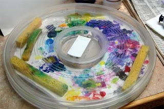
Tip: I paint with acrylics mostly. Over the years I've tried all kinds of palettes designed to keep the paints moist. Additives help, but the best stay-wet palette system I found almost 20 years ago is from Dick Blick. They now call it the Richeson Lock Box, HERE.  With different inserts, it can be used for acrylics, oils, watercolors, you name it. It works. 

It has a simple click on lid, with little sponges that stay inside and keep it humid. I added a couple of extra sponges, and I occasionally give it all a mist of water. Low tech... nothing fancy, but it sure works. Yep, I'm messy. When I can't find a clean spot, I just pop in a fresh palette paper. :-)


Tip: Sometimes I just need to see tiny detail, and find this little clip on magnify works fantastic. 
I clip them on my reading/painting glasses (they also make some for those that don't wear glasses). I have some stronger ones (10 diopter) from my miniature art days, but these are 5 diopter magnification, and work great for this type of detail. They are called Opticaid (HERE) and can be found online at places like Amazon and specialty websites. Totally worth the price if you do detail work. Even though I'm working in tiny detail, my eyes relax, and it's not stressful on them at all. 


Next, adding the last bits of detail and highlights that I can, til I see exactly where the text will fit.


Whew!
We're almost finished with the series. Next time we'll add the text and wrap it up.


Part 1 of the Tutorial starts HERE.  The Steps are more fully explained in each post. 

The Process Summary:
Step 1) What is the main concept; think simplicity
Step 2) Find out the needed technical stuff: aspect ratio, pixels, file size etc.
Step 3) Do a lot of quick thumbnails, in black and white (pencil or digital)
Step 4) Play with color schemes, which supports your concept best
Step 5) Gather any needed reference material
Step 6) Finalize your sketch; think both large & small image readability, & bold text
Step 7) Transfer sketch to your support if paper sketching; or scan in to computer
Step 8) Continue in your chosen medium, or in photoshop (working in Layers) 
Step 9) Font: readability is priority one; must be allowed for commercial use
Step 10) Final copies. Save in PSD. Send needed sizes to author, or what's required by publisher. 

The ideas here are most applicable to the traditional artist who is using a digital art program to do the finish work. Those making 100% digitally created cover art are a horse of a different color. ;-)


Thanks for reading, and I'd love to hear what you think!

Retta

"We are the cups, constantly and quietly being filled. 
The trick is, knowing how to tip ourselves over 
and let the beautiful stuff out." 
--Ray Bradbury, 1920 - 2012


Friday, June 08, 2012

Cover Art Part 5: Continuing the Process


(Part 1 of the Tutorial started HERE) 


It might be a tad long today, but I think we can cover Steps 5, 6 and 7 in one post. Here goes:


Step 5) Gather reference material.
Don't copy other art, just use for accuracy and ideas. If using stock images, you can get them online, either free if allowed to use, or for a small fee. I have filing cabinets full of folders with great reference material, some going back 35 years!! But I must admit, the speed of Google makes it tempting to use that first. But either way, be careful to respect copyrights. At the end of my research, unless I am drawing something that calls for precision, I put all the reference material out of sight, and finish up without it.

Here is the image I used as reference for my figures. Since they are copyrighted images from the Wizard of Oz, I decided to go with a silhouette. Being so iconic, even as a silhouette they would be recognizable.


My printer was on the fritz so the color was wacky. But I didn't care since all I needed was the outline from which to make my silhouette.


Step 6) Finalize your sketch. 
I used Layout Marker paper for my final sketch, because it was sturdy but translucent, but that's just personal preference.
Remember, to be a successful book cover, it must "read" well both large and as small thumbnail. Readability of the text is paramount! Do NOT make the title and author's name font too small. Think big and bold! 

I covered part of this last time in Part 4 (Here)  showing you the "mock up" I sent Jules Joyce,  the books author. 

Before I finalized my image, I ran it through photoshop (I use Photoshop Elements, and find it does everything I need) and looked at it both full size and as a small thumbnail. I had to correct my font size at the bottom, increasing it for legibility.

For example, in Part 2  we saw my mini-schnauzer, Joey, in a mock book cover. What if I hadn't made the font size large enough? It would look like this:


That's hard enough to read, but what happens when it gets reduced to a thumbnail, which is often the FIRST thing a potential reader will see??


You can see the importance of big and bold font sizing! If I hadn't been in a hurry when I made this mock book cover, I'd probably have made it even larger, more like this:


Step 7) Transfer sketch to your ground. 


If on paper, can use transfer grafite paper (I used Saral transfer paper onto gesso coated 140 lb watercolor paper). Or can scan it in to your computer. Or just continue on if you drew it on the computer in the first place. I have a Wacom Bamboo tablet,   which I thoroughly enjoy. But I still love starting the "old fashioned" way. I love the feel, the texture of the materials. I am not only visual, I am tactile, and want to touch it. At times, I even use my fingers along with brushes. 

Tip: Old graphic artists trick: use cheap scotch tape, but first stick it on your skin, then peel off and use on your papers. It'll lose just enough "tack" so it won't tear your paper when removed. No need for expensive specialty tapes for this kind of use.


Tip: If new to using transfer paper, this will help: when tracing your lines, use a different color pen or pencil, so you can easily tell what you've covered, and not miss anything. Do NOT untape all sides until you've peeked underneath to see if you got it all.

Tip: If working in layers (painting some, then adding new elements from your sketch), be sure to add registration marks. Leave the sketch taped to the transfer paper, so it's easy to line it up at the corner registration marks you made on the ground. 


Tip: I made the mistake of not working smooth enough... I coated my 140 lb watercolor paper with gesso, and left in the texture. I love texture... but forgot that when scanned in, the light from the scanner will cause highlights and shadows. I had to remove those later on photoshop from key places on the image, using the smudge and blur tools. Since I love texture, I left it on the background, for a handpainted effect. But it was still VERY time consuming... lesson learned the hard way. :-O

With texture (can click to enlarge):


Later, with texture removed:


Next time, we get to see WIP photos (work in progress)!


Part 1 of the Tutorial starts HERE. The Steps are more fully explained in each post.

The Process Summary:
Step 1) What is the main concept; think simplicity
Step 2) Find out the needed technical stuff: aspect ratio, pixels, file size etc.
Step 3) Do a lot of quick thumbnails, in black and white (pencil or digital)
Step 4) Play with color schemes, which supports your concept best
Step 5) Gather any needed reference material
Step 6) Finalize your sketch; think both large & small image readability, & bold text
Step 7) Transfer sketch to your support if paper sketching; or scan in to computer
Step 8) Continue in your chosen medium, or in photoshop (working in Layers) 
Step 9) Font: readability is priority one; must be allowed for commercial use
Step 10) Final copies. Save in PSD. Send needed sizes to author, or what's required by publisher. 

The ideas here are most applicable to the traditional artist who is using a digital art program to do the finish work. Those making 100% digitally created cover art are a horse of a different color. ;-)

Thanks for reading and I hope you find this interesting,

Wednesday, June 06, 2012

Cover Art Part 4: Color At Last!

(Part 1 of the Tutorial started HERE) 

Oooh, I LOVE color. So experimenting with color schemes was fun for me. As I played with different colors, I always kept in mind my concept. Which brings us to the next step...


Step 4) Play with different color schemes. 
Ask what colors best convey the mood, the message, the main concept. If you sketched your thumbnail out on paper, take it and run it through your art program, playing with colors quickly. And if it will be an e-book, remember some readers do not have color Kindles yet and will be seeing it in black and white. So, make sure you use values that allow the image and text to read well in black and white, also. Yeah... tall order.

Here's what my finished cover looked like in black and white. The yellow sub-title wasn't as light as the white text at the top, but still readable (isn't it amazing the difference color makes?!)


Here are just some of the color experiments I did. And yes, some are ghastly, LOL! The point is, don't be afraid to experiment.


Now is about the time you could firm up your chosen sketch and color scheme and send it to your author  for some feedback. My author was a gem to work for, and very trusting. She didn't ask that I do this step, but I really wanted to make sure she was happy with the direction it was going. She was!

Here was the "mock up" cover art I sent her. See why I said she showed a lot of trust in me, that it would turn out nice in the end? It's pretty rough!


And for comparison, here again is the final version (can click to enlarge).


Part 1 of the Tutorial starts HERE.  The Steps are more fully explained in each post. 

The Process Summary:
Step 1) What is the main concept; think simplicity
Step 2) Find out the needed technical stuff: aspect ratio, pixels, file size etc.
Step 3) Do a lot of quick thumbnails, in black and white (pencil or digital)
Step 4) Play with color schemes, which supports your concept best
Step 5) Gather any needed reference material
Step 6) Finalize your sketch; think both large & small image readability, & bold text
Step 7) Transfer sketch to your support if paper sketching; or scan in to computer
Step 8) Continue in your chosen medium, or in photoshop (working in Layers) 
Step 9) Font: readability is priority one; must be allowed for commercial use
Step 10) Final copies. Save in PSD. Send needed sizes to author, or what's required by publisher. 
The ideas here are most applicable to the traditional artist who is using a digital art program to do the finish work. Those making 100% digitally created cover art are a horse of a different color. ;-)

Thanks for reading, and I'd love to hear what you think!

Monday, June 04, 2012

Cover Art Part 3: Fun with Thumbnails


(Part 1 of the Tutorial started HERE) 

Oh goodie. We made it past the technical stuff and today are into the fun stuff. :-)


Step 3) Do a lot of quick thumbnails. 
Fast little sketches... my first ones are sometimes no more than 3 or 4 inches. Play with it. Try out various compositions, just using pencil or pen, in black and white. Don't worry about color yet. Some of these ideas will vary in their usefulness to you. It depends if you are working on your computer in an art program, with pencil and paper, or a combination of both (which is how I ended up doing it). 

I forgot to take photos of the various thumbnails I sketched, so found only these early ones that I didn't use:


Did you notice above where I wrote "in black and white"? Trust me, there are several advantages in doing your thumbnails this way. The biggest one being, that if an image "holds it's own" in black and white, it will almost ALWAYS work in color. 

In fact some say almost ANY color will work if the values (relative darks and lights) are done well. Plus, you don't want to invest lots of time in a thumbnail; do lots, fast and sketchy, trying out all kinds of crazy ideas. If you find one you really like, then you can invest a little more time on it.

Tip: Is your image boring? Bland? Blah?  
Solution: try punching up the values. Make your lightest lights LIGHTER, and your darkest darks DARKER. Not all over, just in chosen spots to give it sparkle and drama. If working on paper, scan it in to your art program, and play with the values. You might be pleasantly surprised.

An example:

1. Here's a painting of mine as it would look if there were not enough value contrast. Blah...


2. Here's the same painting, with high value contrast, the lights and darks both punched up. 


3. And here is how that plays out in color. 


Next time, we get to play with COLOR... yay!!!


Part 1 of the Tutorial starts HERE. The Steps are more fully explained in each post. 

The Process Summary:
Step 1) What is the main concept; think simplicity
Step 2) Find out the needed technical stuff: aspect ratio, pixels, file size etc.
Step 3) Do a lot of quick thumbnails, in black and white (pencil or digital)
Step 4) Play with color schemes, which supports your concept best
Step 5) Gather any needed reference material
Step 6) Finalize your sketch; think both large & small image readability, & bold text
Step 7) Transfer sketch to your support if paper sketching; or scan in to computer
Step 8) Continue in your chosen medium, or in photoshop (working in Layers) 
Step 9) Font: readability is priority one; must be allowed for commercial use
Step 10) Final copies. Save in PSD. Send needed sizes to author, or what's required by publisher. 

The ideas here are most applicable to the traditional artist who is using a digital art program to do the finish work. Those making 100% digitally created cover art are a horse of a different color. ;-)


Thanks for reading, and I'd love to hear what you think!

Retta